Tomato was founded in 1991 as a collective of artists, designers, musicians and writers.
Each one of the creatives involved is a partner, sharing their own field of expertise and experience with the wider group. This has led to regular collaboration within the collective and continues to be a source of inspiration and reinvention for those involved.
During my first year I've been very open minded. Motion graphics is something I'd definately like to explore, so I looked at Tomato for inspiration.
Smirnoff
smirnoff shot at hd on the phantom for the latest television commercial. type added in the flame with glyn at glassworks.
ford mondeo
type based television commercials for the release of the new ford mondeo with bi-xenon headlights.The concept behind this commercial is that the lights are so bright, the driver can see whats coming next. Tomato use kinetic typography to build a scene where you are wondering whats coming next.
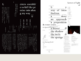
Idea Magazine No.337
Spreads from Idea Magazine No.337 which features a 144 page essay on The Floating World, Process, Tomato and Underworld. Assisted by Toru Yoshikawa, Japanese Typography by Yoshihisa Shirai.
Identity for the City of Sapporo/the g8 summit that is being held in Hokkaido, July 2008.


No comments:
Post a Comment