Sunday, 9 October 2011

NSS Poster design

I've been asked as part of a university project to compete in a poster competition for the National Student Survey. The brief demands a promotional poster to encourage students to participate in the survey. We've been given the following straplines to work with, or if we choose make our own.

• Leave your mark
• Have your say
• Be heard
• Your opinion matters
• Speak up

The following are poster designs of previous competition entries which were shortlisted. I've seen some innovative designs and also some bad one's.


Quite a simple but effective design. The illustration seems fitting, especially considering the target audience.


To me, this design feels far too generic. It also seems the obvious answer and typical of a student poster. There's also not a lot of cohesion because for me there hasn't been to much consideration for layout. Despite this, elevating the typography for the word "up" is a nice feature.

This image was selected as the winner in 2010. I can see why it might of been a popular choice, however I don't like the design. There's a lot of explosive energy and exitement within the poster (typical of student life perhaps) therefore it'd most probably appeal to the vast majority of students.

Below is the basis of the design I want to incorporate into the poster. I chose the strap line "Make your mark" and the concept of the design is using a finger print to represent the word "mark". However the fingerprint also offers alternative meanings. Because the survey is very peronal, I wanted to represent this through a fingerprint as everyone has different fingerprint marks but more more importantly different opinions.

I achieved the fingerprint by using acrylic paint on my own finger. I then scanned it at a high resolution into Adobe Illustrator and live traced the image. The idea behind this was to turn it into vector format instead of pixels so the image wouldn't distort itself when enlarged.


The is a mockup poster design which I scrapped because the hand doesn't offer anything to the image. I realized I already held the concept within the fingerprint. Although I am quite happy with the visual look of the hand, which I wrapped in clingfilm  and scanned, however it is irrelevent. I highlighted the word your with I black box because for me it holds importance to the viewer. Another element I incorporated into the design was the finger print replacing the letter "O" in "Your". This draws the viewers attention. I also believe I need to utilize the space better. theis a lot of negative space which doesn't look very pleasing.


Here's a developed version of my poster. I scrapped the image of the hand and focused on the concept of the fingermark. I think the combination of yellow, black and white complement eachother very well. There's a lot of open space, however the boldness of the boxes and type draw the viewers to the strapline. I chose to use yellow to communicate with my target audience, it represents a youthful, dynamic approach. The poster also proves efficient as I've incorporated a grid system, it's quite basic but adds to a cohesive design.

Final image.


Using colour also aloud me to experiment quite freely with a range of different colours. It also allows people to completely customize it to their own taste.

I also thought that the poster design concept would be a nice gimic for a leaflet or flyer. Something small and compact which people could keep maybe.


Friday, 29 April 2011

Tomato


Tomato

Tomato was founded in 1991 as a collective of artists, designers, musicians and writers.
Each one of the creatives involved is a partner, sharing their own field of expertise and experience with the wider group. This has led to regular collaboration within the collective and continues to be a source of inspiration and reinvention for those involved. 

During my first year I've been very open minded. Motion graphics is something I'd definately like to explore, so I looked at Tomato for inspiration. 


Smirnoff

smirnoff shot at hd on the phantom for the latest television commercial. type added in the flame with glyn at glassworks.


ford mondeo
type based television commercials for the release of the new ford mondeo with bi-xenon headlights.The concept behind this commercial is that the lights are so bright, the driver can see whats coming next. Tomato use kinetic typography to build a scene where you are wondering whats coming next. 


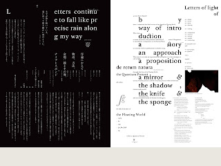
Idea Magazine No.337
Spreads from Idea Magazine No.337 which features a 144 page essay on The Floating World, Process, Tomato and Underworld. Assisted by Toru Yoshikawa, Japanese Typography by Yoshihisa Shirai.


Identity for the City of Sapporo/the g8 summit that is being held in Hokkaido, July 2008.


Sunday, 27 February 2011

Personnel interest: The 2010 FIA Formula One World Championship at Silverstone.

The British Grand Prix is a race in the calendar of the FIA Formula One World Championship. It is currently held at the Silverstone Circuit near the village of Silverstone in Northamptonshire. The British and Italian Grands Prix are the oldest continuously staged Formula One World Championship Grand Prix.

Originally the British Grand Prix venue was meant to of been held at Donington park. The proposed move to Donington on a long-term contract was announced in July 2008, but a deadline passed for the company redeveloping the circuit to prove it had the £135m funding required. This wasn't the case and the venue was moved to Silverstone.


Friday Practise one, I was able to get into a grandstand on Copse corner leading onto the mainstraight where I was able to ge some good shots. 
 Karun Chandock in the Hispania on the main straight.
 Kubica and Alguesuari through copse corner
 Kunica through Copse Corner
 Felipe Massa through Copse
Mark Webber entering the pits


Tatsuo Miyajima:

Tatsuo Miyajima Japanese sculptor and installation artist. He finished undergraduate and postgraduate studies at the Tokyo National University of Fine Arts and Music in 1986 and came to prominence in the late 1980s with installations of digital counters in the form of light-emitting diodes. He made his first counter in 1988 and subsequently retained this form as his basic building block: a large, two-digit red display, it continually counts from 1 to 99, never reaching 100 or registering zero.
Counter Void, 2003
Collection of tv asahi, Tokyo
Directed by Fumihiko Maki
Photo: Kunihiko Katsumata
Courtesy of Shiraishi Contemporary Art Inc

Over the past few years, it has been Miyajima's monumental public art projects around the world that have attracted the most attention. Starting with a public art project for Geneva University, Switzerland in 1997, he has steadily broadened his scope, creating a series of large site-specific works that include Sea of Time '98, for the Art House Project on Naoshima Island, Okayama, Counter Void for the TV Asahi headquarters in Roppongi Hills, Tokyo, Time Garden in Izumi City, Osaka, and Transcend Section for the entrance to the Leeum, Samsung Museum of Art in Seoul, Korea. While retaining his focus on counters to convey his messages, he utilizes neon lights, liquid crystal and even performance art in addition to LEDs.